What Is Corporate Identity? Elements and Creation Process
See how corporate identity connects logos, colour, typography and tone of voice. Use an example to define brand guidelines, applications and project deliverables.
Quick Answer
What Does Corporate Identity Include?
Logo, Corporate Identity and Brand Image
What Should an Identity Project Deliver?
How to Develop a Corporate Identity
Gather the Requirements and Existing Materials
Test the Direction in Realistic Conditions
Document the Rules and Hand Them Over
Example: Applying an Identity to a Maintenance Business
What to Check at Handover and During Use
Quick Answer
Corporate identity organises how an organisation expresses itself visually and verbally. Design work can cover the logo, colour, typography, imagery and usage rules. Guidelines make those decisions usable, while files and templates should match the organisation’s actual points of contact.
Your proposal uses one typeface, social posts use another colour palette, and the website displays a third version of the logo. Customers encounter the same organisation in several different forms. You may not need to redesign every item; first establish which elements to use and the rules for applying them.
What Does Corporate Identity Include?
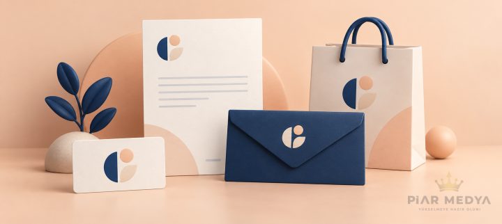
Corporate identity brings together how an organisation expresses itself visually and verbally, alongside its principles of behaviour. In a design project, the tangible work includes the logo family, colours, typography, image direction, tone of voice and usage rules. The scope should follow real points of contact rather than assume every business needs every application. Explore colour associations and palette examples when choosing alternatives, without assuming that a colour has the same effect in every setting.
An online consultancy may prioritise proposals, presentations and web pages. A business with physical premises may need signage, packaging and wayfinding. Resolving the materials your team uses daily is more useful than commissioning a large set of applications nobody needs.
Logo, Corporate Identity and Brand Image
A logo is one of the signs that helps people recognise an organisation. Corporate identity establishes the colours, typography, imagery and language used around it. Brand image describes the perception people form of the organisation. Products, service and actual experiences contribute to that perception alongside design.
A new logo does not complete the whole identity. Our guide to logos and logo design covers the decisions within that narrower task. The question here is whether different people can apply the chosen identity consistently.
What Should an Identity Project Deliver?
A “corporate identity package” is not a fixed, standard product. Ask for an itemised list of files and applications. The table below shows how a scope could be organised; it is not a mandatory shopping list for every organisation.
| Area | Expected Output | Review Question |
|---|---|---|
| Logo System | Primary logo, appropriate alternatives and usage rules | Does it remain legible in small spaces and on different backgrounds? |
| Colour and Typography | Colour values, typefaces and hierarchy | Can the team access the files and required usage rights? |
| Visual and Verbal Direction | Photography or illustration approach, sample copy and tone | Can different contributors make consistent decisions? |
| Application Templates | Relevant presentations, proposals, business cards or social layouts | Do they work with real, lengthy content? |
| Guidelines and Handover | Usage examples, a file inventory and version information | Can a new team member choose the correct file? |
Adobe's explanation of brand guides covers voice and tone alongside visual elements. A guide earns its value by answering the decisions a team faces, rather than by reaching a particular page count.
How to Develop a Corporate Identity
Gather the Requirements and Existing Materials
Describe the audience, the offer and how the organisation wants to be understood. Collect current logos, presentations, signage, website pages and printed materials in one place. Separate what needs to change from what can remain. Unsupported claims such as “industry leader” should not be carried into the new design's copy. Use the brand identity brief questions and example to organise the starting document.
Test the Direction in Realistic Conditions
Do not assess options only as large logo images. Try a long company name, a narrow space, an ordinary office printer and a mobile screen. Label concept applications as illustrative; an unproduced packaging mock-up should not be presented as a photograph of a finished product.
Document the Rules and Hand Them Over
Receive the approved files, templates and guidelines together. Use a folder structure that reduces the chance of obsolete versions being selected. Decide who approves changes and where the current version lives. Work produced by separate teams should refer to the same guidance.
Example: Applying an Identity to a Maintenance Business
Suppose a fictional maintenance company updates its proposal PDF, vehicle graphics and website together. The proposal needs detailed service descriptions, the vehicle needs short information visible at a distance, and the website needs an enquiry form. Rather than repeat one composition everywhere, create different layouts using shared colour, typography and logo rules.
Review the legibility of figures in the proposal, contact details on the vehicle and labels in the form. Website layout and interaction decisions belong to the web design process. Identity guidelines provide direction; the working interface still needs design and testing.
The company's language might favour specific descriptions of equipment and work over vague claims of superiority. The example illustrates how identity choices carry into everyday materials. It does not claim measured commercial gains from a real project.
What to Check at Handover and During Use
File names, logo versions and typeface details should match the guidelines. Before sending screen artwork to print, confirm the printer's required files and colour settings. RGB and CMYK colour models serve different output contexts; an exact match between a screen and printed colour should not be assumed.
Open templates with real content: a long job title, a second address, a new product name or a multi-line description. Does the layout still work? Recording problems at handover provides more useful feedback than approving polished sample images alone. Clarify usage conditions for fonts, photographs and other third-party assets separately from file delivery. Use the graphic design mistakes checklist when reviewing the final output.
If the current identity works, a full replacement may be unnecessary. Missing digital templates or unclear application rules can call for a narrower project. List your priority touchpoints, then discuss the specific outputs needed through Piar Medya's graphic design services.
FREQUENTLY ASKED QUESTIONS (FAQs)
A company can use shared logo, colour and typography rules across its proposals, website and signage. Layouts still need to suit each setting. Consistency means applying the system appropriately, rather than copying one image onto every surface.
No. A logo is one element. Colour, typography, image direction, tone of voice and application rules can form part of the wider system. The required applications should reflect the materials the organisation actually uses.
Guidelines explain how different contributors should apply the approved identity. They can document logo versions, colours, typography and example applications. They should help the team choose the right files and make consistent decisions when producing new materials.
Gather the audience definition, offer, current materials and priority applications. Explain what should remain, which problems need fixing and who will approve decisions. Treat unverified claims about the organisation as issues to resolve, not copy to carry forward.
Identity describes the elements and rules the organisation chooses to express itself. Image is the perception people form of it. Design can contribute, but service experiences and the organisation’s behaviour affect that perception too.
A template may provide a starting point. Check it against your logo, colour, typography and content rules, then test it with real material. Confirm the usage conditions and whether your team can edit the necessary files before relying on it.