Typography from A to Z: A Comprehensive Guide for Your Brand's Visual Language
What is typography and how does it affect brand identity? A comprehensive guide on choosing the right typeface, fundamental elements, rules, and common mistakes. You will find answers to all your questions related to topic Typography from A to Z: A Comprehensive Guide for Your Brand's Visual Language in the continuation of the text.
A Comprehensive Design Guide for Your Brand's Silent Voice
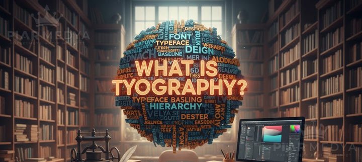
What is Typography? The Meaning Beyond the Words
Why Does Typography Determine a Brand's Fate? (Its Strategic Importance)
The Anatomy of Typography: Fundamental Elements That Bring Design to Life
How to Choose the Right Typeface for Your Business (A Step-by-Step Guide)
Common Typography Mistakes That Damage a Brand's Image
Conclusion: Typography is Not Just Letters, It's Your Brand's Voice
Every day, we are exposed to hundreds of brand messages. Why do some brands' voices sound louder while others get lost in the crowd? The answer is often hidden in an art that is seen but not consciously noticed: Typography. Typography is the "tone of voice" of a brand's visual identity. How the words look is just as important as what they say in determining the message's power, emotion, and credibility. It is not just the art of arranging letters, but also the science of communicating, creating emotion, and shaping the user experience.
A Comprehensive Design Guide for Your Brand's Silent Voice
In our comprehensive guide, we will cover every detail, from the fundamentals of typography to how it affects a brand's destiny, from the subtleties of choosing the right typeface to common fatal mistakes. Our goal is not just to give you information, but to equip you with a conscious and strategic typographic approach to your designs. Remember, effective design is not just aesthetic, but also functional. If you want to reflect your brand's voice correctly with a professional touch, our expert graphic design team is always here for you.
What is Typography? The Meaning Beyond the Words
In its most basic definition, typography is the art and technique of arranging letters and text to make writing legible, readable, and appealing. Its origin comes from the Greek words "typos" (form, impression) and "graphein" (to write). However, in the modern world, typography has gone far beyond this technical definition. It is a strategic tool that determines the spirit and character of a text and directs how the reader perceives the content.
Why Does Typography Determine a Brand's Fate? (Its Strategic Importance)
Good typography goes unnoticed because it fluently conveys the message. Bad typography, however, is an instant distraction and makes one question the brand's professionalism. Here is the strategic importance of typography:
- Brand Identity and Personality: The typeface you choose reflects your brand's personality. A strong, serif font portrays a traditional and trustworthy image, while a modern, sans-serif font exhibits an innovative and minimalist stance. Typography is one of the cornerstones of your corporate identity.
- Readability and User Experience (UI/UX): Especially in web design, typography is at the center of the user experience. Correct line height, letter spacing, and font size ensure the text is easy to read. Typography that doesn't tire the user allows them to stay on your site longer and receive your message clearly.
- Emotional Impact and Communication: The shape, weight, and style of letters evoke different emotions in the reader. An elegant script font might suggest romance, while a bold, blocky font conveys strength and stability. Typography, just like colors, sets the emotional tone of the text.
- Professional Image and Credibility: Consistent and carefully chosen typography shows that your brand pays attention to detail and is professional. It directly increases your customers' trust in your brand.
The Anatomy of Typography: Fundamental Elements That Bring Design to Life
To create effective typography, one must know some fundamental concepts. These graphic design elements determine both the aesthetic and functional quality of the text.
- Typeface Families:
- Serif: These have small lines or strokes (serifs) attached to the end of larger strokes in a letter. They convey a traditional, formal, and classic feeling. They are often used in books and newspapers as they are considered easier to read in long texts. (e.g., Times New Roman, Garamond).
- Sans-serif: These are modern, minimalist fonts without serifs. They are popular on websites and mobile apps due to their high readability on digital screens. (e.g., Helvetica, Arial, Open Sans).
- Script: Elegant and intimate fonts that mimic handwriting. They are often used for invitations and logos but are not suitable for long texts.
- Display: Artistic fonts designed to attract attention, typically used in large sizes. They are ideal for headlines and posters.
- Hierarchy: The art of showing the most important information first. Differentiating headings, subheadings, and body text using different sizes, weights, or styles makes it easier for the reader to scan and understand the content.
- Contrast: The visual difference between the text and the background or between different typographic elements. Sufficient contrast enhances readability, while creative use of contrast adds dynamism to the design.
- Kerning, Tracking, Leading (Spacing Adjustments):
- Kerning: Adjusting the space between two specific letters (e.g., narrowing the space between 'A' and 'V').
- Tracking: Adjusting the overall spacing between all letters in a word or sentence.
- Leading (Line Height): The vertical space between lines of text. Proper leading prevents text from looking too cramped or too sparse.
- Alignment: How the text is aligned relative to the margins. It can be left, right, centered, or justified. For web text, the best readability is generally achieved with left-aligned text.
How to Choose the Right Typeface for Your Business (A Step-by-Step Guide)
Choosing the right font is like choosing the right outfit for your brand. You can follow these steps in the process:
- Define Your Brand's Personality: Is your brand modern or traditional? Fun or serious? The answers to these questions will give you clues about the character of the font you should choose.
- Understand Your Target Audience: Who is the audience you are addressing? Dynamic and modern fonts might be suitable for a younger audience, while more classic and established fonts may be required for a corporate audience.
- Consider the Platform: Will the font be used in printed materials or on digital screens? Some fonts look great on screen but may not have the same effect in print. Especially for your website, make sure the font you choose is licensed and compatible with various screens on platforms like Google Fonts.
- Prioritize Readability: Readability is paramount, especially for long texts and on mobile devices. Choosing a font that is difficult to read for aesthetic reasons will cause you to lose users. We recommend working with experienced web design agencies on this matter to achieve the most effective results.
- Check the Licensing: Not every font you find on the internet is free for commercial use. Make your choice by carefully reading the license terms from reliable sources like Adobe Fonts.
Common Typography Mistakes That Damage a Brand's Image
Avoiding bad design is as important as good design. Here are the most common typographic mistakes:
- Using Too Many Fonts: Using more than two, or at most three, typeface families in a single design causes clutter and an unprofessional look.
- Ignoring Readability: Using very small point sizes, insufficient contrast, or hard-to-read script fonts in body text.
- Incorrect Spacing: When letters, words, or lines are too close together or too far apart, it disrupts the flow of the text.
- Choosing an Inappropriate Font for the Purpose: Using a fun and childish font (e.g., Comic Sans) on the website of a serious law firm.
Conclusion: Typography is Not Just Letters, It's Your Brand's Voice
Typography is the invisible skeleton of a design. When done correctly, it strengthens your brand's message, creates an emotional connection with your target audience, and leaves a professional impression. Every detail, from typeface selection to spacing adjustments, should be a conscious decision that reflects your brand's identity and value.
If you need help bringing your brand's voice to life with the right typography and creating a professional impact in your designs, the experienced graphic design agency at Piar Medya is ready to realize your project. To see inspiring typography applications, you can browse sites like Awwwards and Behance.