Why is a Mobile-Friendly Website Mandatory? A Comprehensive Responsive Design Analysis
What is responsive web design (RWD) and why is it vital for your business? Everything from Google's mobile-first indexing to increased conversions is in this guide. You will find answers to all your questions related to topic Why is a Mobile-Friendly Website Mandatory? A Comprehensive Responsive Design Analysis in the continuation of the text.
Responsive Design: A Comprehensive Guide to Mobile-Friendly Websites
What Exactly is Responsive Web Design (RWD)?
Responsive Design vs. Mobile Site: Why Are They Worlds Apart?
Why Responsive Design is a Necessity, Not a Luxury, for Your Business
1. Google's Mobile-First Indexing
2. Superior User Experience (UX)
3. Increased Conversion Rates
4. Protecting Your Advertising Budget
5. Being Future-Proof
Conclusion: Your Digital Presence Begins on Mobile Devices
The smartphone in your pocket is no longer just a communication tool; it's your primary window for exploring the world, shopping, and searching for information. According to data from Statista, in 2025, more than 70% of global internet traffic will come from mobile devices. Now, answer this question honestly: How does your website look when viewed through the window of this massive audience? Can users read your content comfortably, or are they constantly forced to zoom in and out to see the text? The answer to this question holds the key to your success in the digital world.
Responsive Design: A Comprehensive Guide to Mobile-Friendly Websites
In our comprehensive guide, we will take a deep dive into the concept of Responsive Web Design (RWD), the gold standard of the modern web. You will learn in full detail what responsive design is, how it works, and why in 2025 it is not an option, but an absolute necessity.
What Exactly is Responsive Web Design (RWD)?
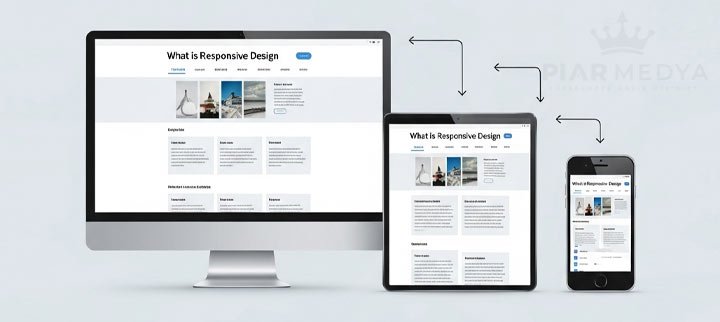
Responsive Web Design is a technique that allows a website to intelligently adapt and reconfigure itself according to the screen size (desktop computer, tablet, smartphone, etc.) and orientation of the device on which it is being viewed. In short, a single website offers a flawless user experience on all devices.
We can compare this to the behavior of a liquid: Water takes the shape of the glass, pitcher, or bottle it is poured into. A responsive website also reshapes its content to be most readable and usable according to the dimensions of the screen it is on.
Three core technical principles lie behind this "magic":
- Fluid Grids: Defining the widths of page elements with proportional units like percentages (%) instead of fixed units like pixels (px).
- Flexible Images: Ensuring that images scale up or down according to the size of their containing element.
- Media Queries: Allowing the site to apply specific style rules for different screen sizes with CSS commands, such as, "If the screen width is less than 768 pixels, hide the menu and show an icon." One of the most authoritative resources on this topic, MDN Web Docs, explains the technical details wonderfully.
Responsive Design vs. Mobile Site: Why Are They Worlds Apart?
A common method in the past was to have separate mobile sites, typically on a subdomain like "https://www.google.com/search?q=m.sitename.com," which were a scaled-down version of the desktop site. However, this approach is now obsolete. Why?
- Management Difficulty: Updating two separate sites means twice the work and cost.
- SEO Risks: Having similar content on two different URLs can lead to "duplicate content" issues and negatively impact your SEO performance.
- Poor User Experience: Mobile sites are often a stripped-down version of the desktop site and do not offer all features, which disappoints users.
Responsive design eliminates all these problems with a single URL and a single content base.
Why Responsive Design is a Necessity, Not a Luxury, for Your Business
Having a mobile-friendly website is no longer just a "nice-to-have" feature; it is the main pillar of your digital presence.
1. Google's Mobile-First Indexing
This is the most critical point. When ranking websites, Google now primarily crawls and evaluates their mobile versions. This means if your site's mobile version is slow, difficult to use, or has incomplete content, you cannot rank higher, no matter how fantastic your desktop version is. In short, in Google's eyes, your site is only as good as its mobile version.
2. Superior User Experience (UX)
A mobile-friendly site allows visitors to easily access the information they're looking for, click on buttons comfortably, and not get lost in menus. A positive experience lowers the "Bounce Rate" and encourages visitors to spend more time on your site. This signals to Google that your site is valuable.
3. Increased Conversion Rates
If users can easily browse products, fill out forms, or get a quote from their mobile devices, their likelihood of making a purchase or contacting you increases exponentially. Especially for e-commerce sites, mobile conversion rates are directly related to responsive design.
4. Protecting Your Advertising Budget
Imagine a visitor you've attracted to your site with Google Ads immediately leaving because of a non-mobile-friendly page. This is literally throwing your ad budget in the trash. A responsive landing page directly impacts the return on investment (ROI) of your ad spend.
5. Being Future-Proof
Responsive design is not just for today's phones. It ensures your site is ready for the different-sized tablets, foldable devices, or smart screens of tomorrow. This also shows that your brand is technologically current and forward-thinking.
Conclusion: Your Digital Presence Begins on Mobile Devices
In 2025, a website that isn't mobile-friendly is no different from a shop that closes its door on 70% of its customers. Responsive design is the first and most crucial step you must take to provide your visitors with the flawless experience they deserve, to achieve the rankings you deserve on Google, and to get the maximum return from your digital investments.
At Piar Medya, we don't just write code; we develop a strategy with a "mobile-first" philosophy. We start the design process by first considering the smallest screen, ensuring your brand's message is communicated clearly and effectively on every platform. Are you ready to claim your rightful place in the digital world with a professional and fully responsive website?